
Mailing Kiosk Demo
Published:
Building an Interactive Package Mailing Kiosk Prototype
Kiosks are everywhere, from airports to post offices, making daily tasks quick and easy. As a fun project, I decided to create a self-service kiosk prototype for mailing packages. This mini-project gave me the opportunity to sharpen my web development skills, focusing on user experience (UX) and building a fluid, interactive interface.

In this post, I’ll walk through the process of creating the kiosk, the challenges I faced, and the design choices that shaped the final product.
Project Overview
The goal of the kiosk prototype is to simulate the process of mailing a package. It guides users through these key steps:
- Selecting a service (Package or Letter).
- Weighing the package.
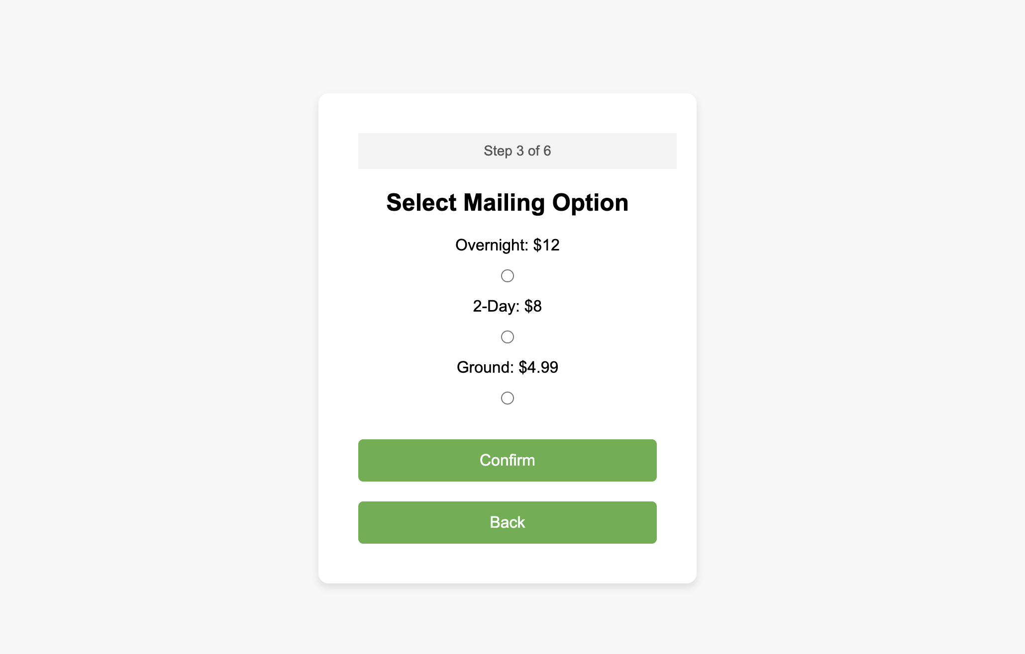
- Choosing a mailing option (Overnight, 2-Day, or Ground).
- Entering the recipient’s shipping address.
- Reviewing all the information.
- Simulating the payment process—complete with a fun twist at the end.
The project is built using HTML, CSS, and JavaScript, with a focus on user flow, form validation, and interactivity.
Technologies Used
- HTML5: For structuring the layout of the kiosk interface.
- CSS3: For styling the UI, adding visual cues, and creating a smooth user experience.
- JavaScript (ES6): For controlling the flow between screens, validating user inputs, and simulating the payment process.
Step-by-Step Walkthrough
1. Service Selection Screen
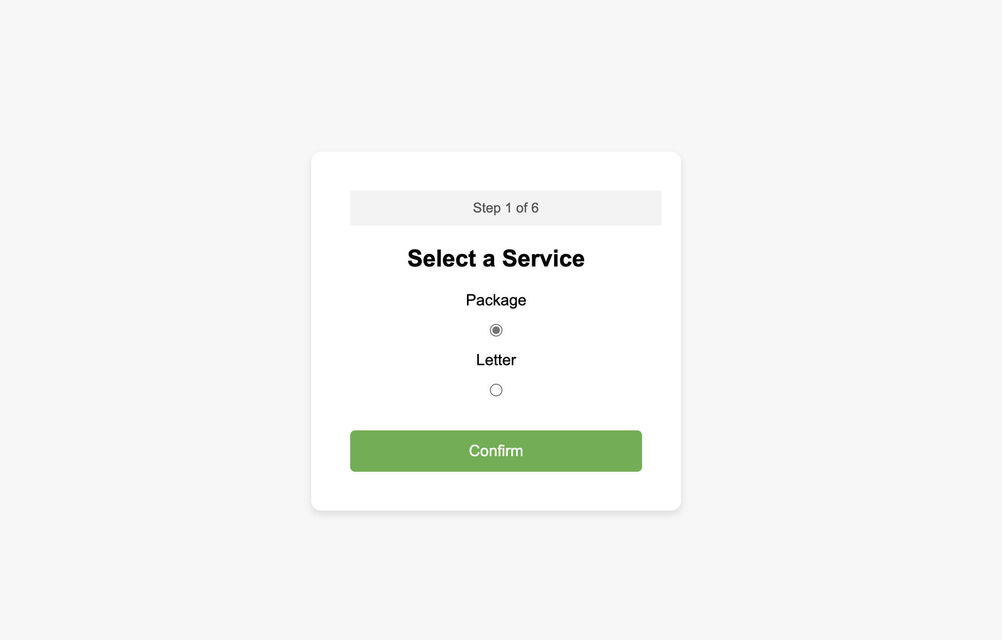
The first screen allows users to select whether they are mailing a package or a letter. The user’s choice is validated before moving to the next screen.
Here’s the HTML for the service selection screen:
<!-- Service Selection Screen -->
<div id="screen1" class="screen">
  <div class="progress-bar">Step 1 of 6</div>
  <h2>Select a Service</h2>
  <form>
    <label for="package">Package</label>
    <input type="radio" id="package" name="service" value="package">
    <label for="letter">Letter</label>
    <input type="radio" id="letter" name="service" value="letter">
    <button type="button" id="confirmService">Confirm</button>
  </form>
</div>
2. Weigh Package and Visual Cues
The weigh your package screen includes an interactive visual cue in the form of a CSS right-pointing arrow, helping users place their package in the basket.
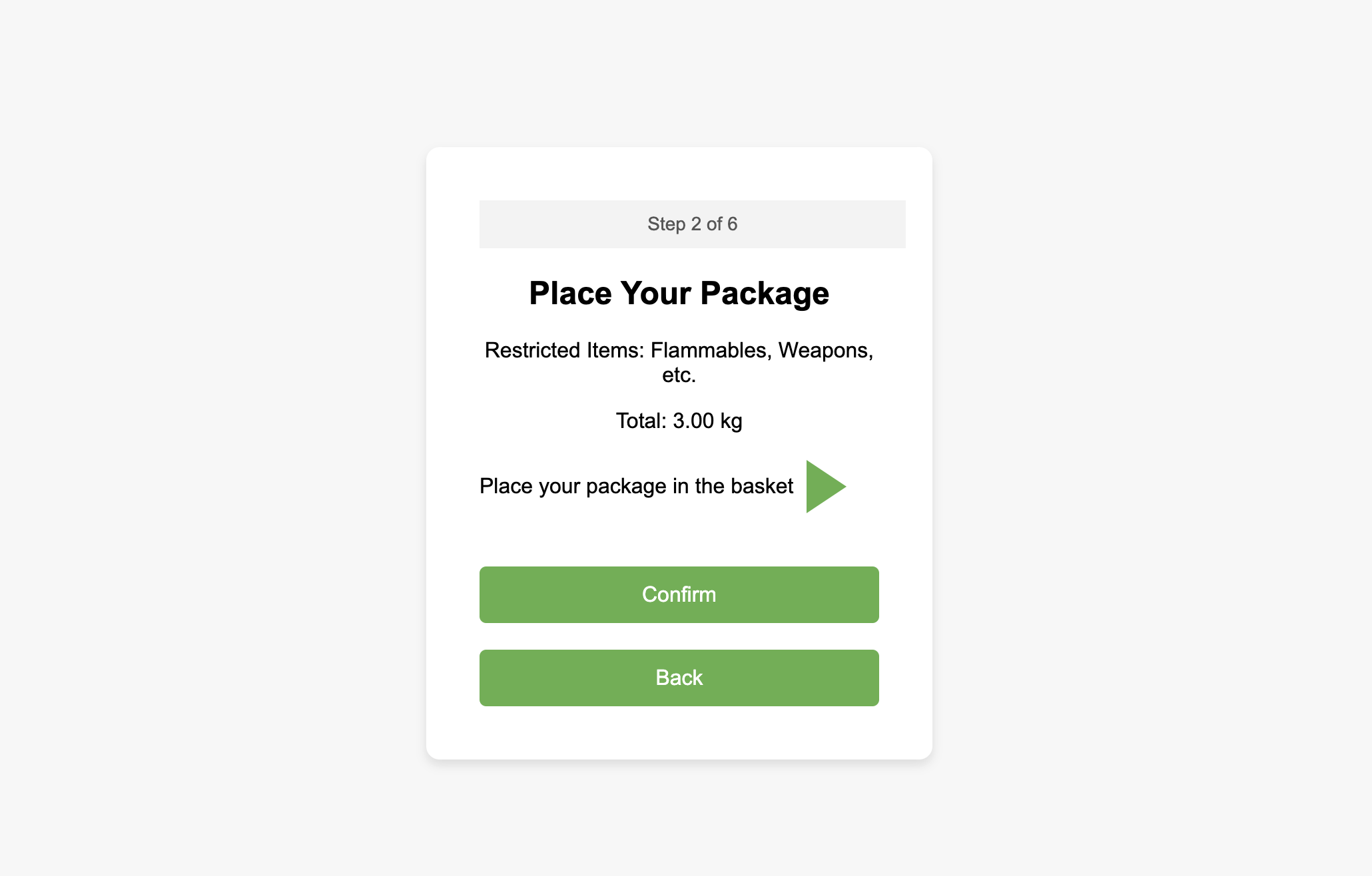
<!-- Weigh Your Package Screen -->
<div id="screen2" class="screen">
  <div class="progress-bar">Step 2 of 6</div>
  <h2>Place Your Package</h2>
  <p>Total: 3.00 kg</p>
  <div class="arrow-container">
    <span>Place your package in the basket</span>
    <div class="right-arrow"></div> <!-- Right arrow using CSS -->
  </div>
  <button type="button" id="confirmPackage">Confirm</button>
</div>
Here’s the CSS for the right arrow:
/* Right Arrow Styling */
.right-arrow {
  width: 0;
  height: 0;
  border-top: 20px solid transparent;
  border-bottom: 20px solid transparent;
  border-left: 30px solid #4CAF50; /* Green Arrow */
  margin-left: 10px;
}
3. Entering the Shipping Address
Once the user selects the mailing option and places their package, they proceed to the address input screen, where they must enter the recipient’s address and zip code. Proper form validation ensures the inputs are correct.
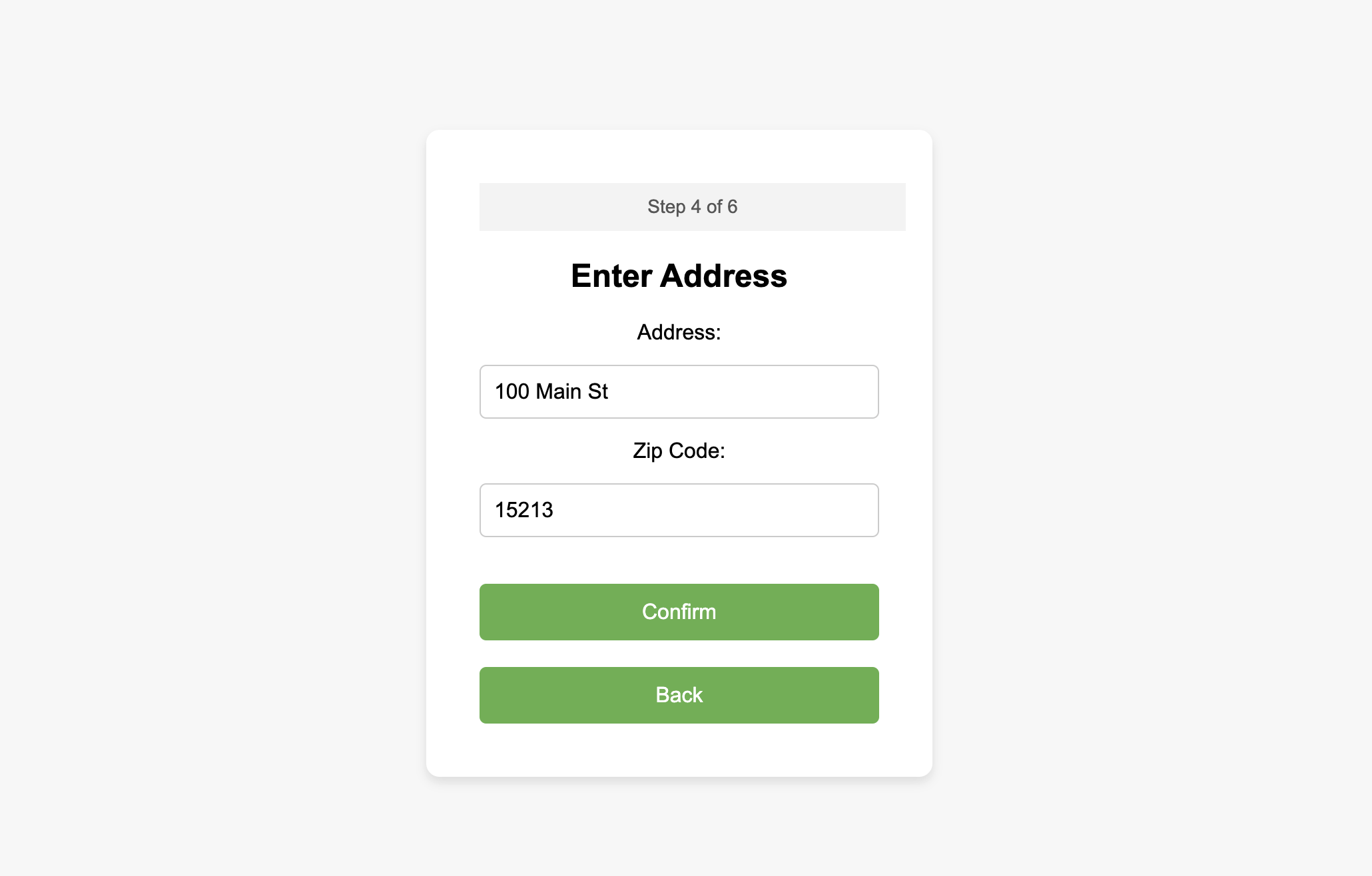
<!-- Enter Address Screen -->
<div id="screen4" class="screen">
  <div class="progress-bar">Step 4 of 6</div>
  <h2>Enter Address</h2>
  <form>
    <label for="address">Address:</label>
    <input type="text" id="address" placeholder="100 Main St">
    <label for="zip">Zip Code:</label>
    <input type="text" id="zip" placeholder="15213">
    <button type="button" id="confirmAddress">Confirm</button>
  </form>
</div>
JavaScript Validation ensures that the address and zip code fields are filled correctly before allowing the user to proceed.
// Address Validation
confirmAddressBtn.addEventListener('click', function() {
  const address = document.getElementById('address').value.trim();
  const zip = document.getElementById('zip').value.trim();

  if (!address || !zip) {
    alert("Please enter both address and zip code.");
    return;
  }

  if (!/^\d{5}$/.test(zip)) {
    alert("Please enter a valid 5-digit zip code.");
    return;
  }

  // Proceed to the next screen after validation
  showScreen(screen5);
});
4. Review Screen
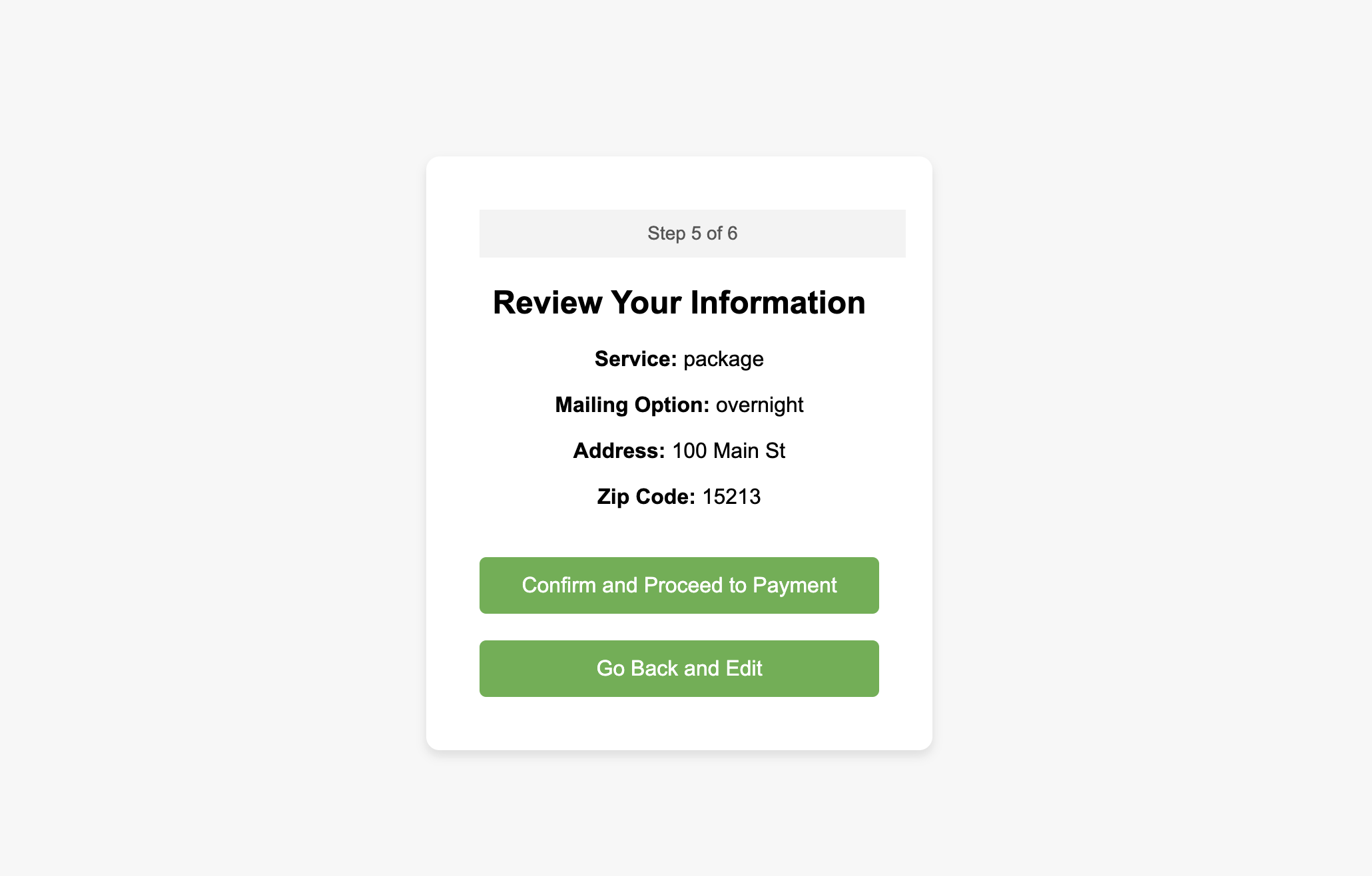
Before making a payment, the user reviews their selections, including the service type, mailing option, and address.
<!-- Review Information Screen -->
<div id="screen5" class="screen">
  <div class="progress-bar">Step 5 of 6</div>
  <h2>Review Your Information</h2>
  <p><strong>Service:</strong> <span id="reviewService"></span></p>
  <p><strong>Mailing Option:</strong> <span id="reviewMailing"></span></p>
  <p><strong>Address:</strong> <span id="reviewAddress"></span></p>
  <p><strong>Zip Code:</strong> <span id="reviewZip"></span></p>
  <button type="button" id="confirmReview">Confirm and Proceed to Payment</button>
</div>
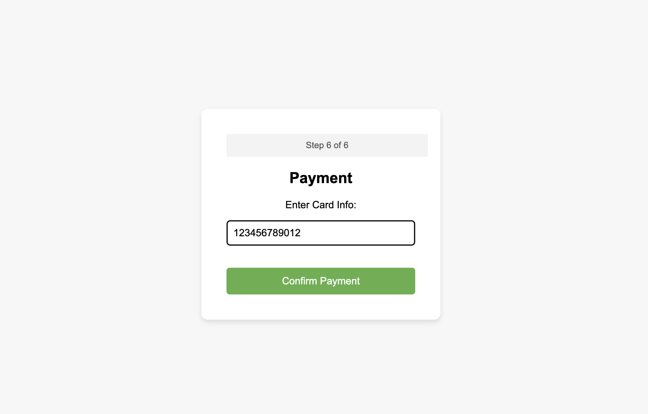
5. Simulating the Payment Process (with a Twist!)
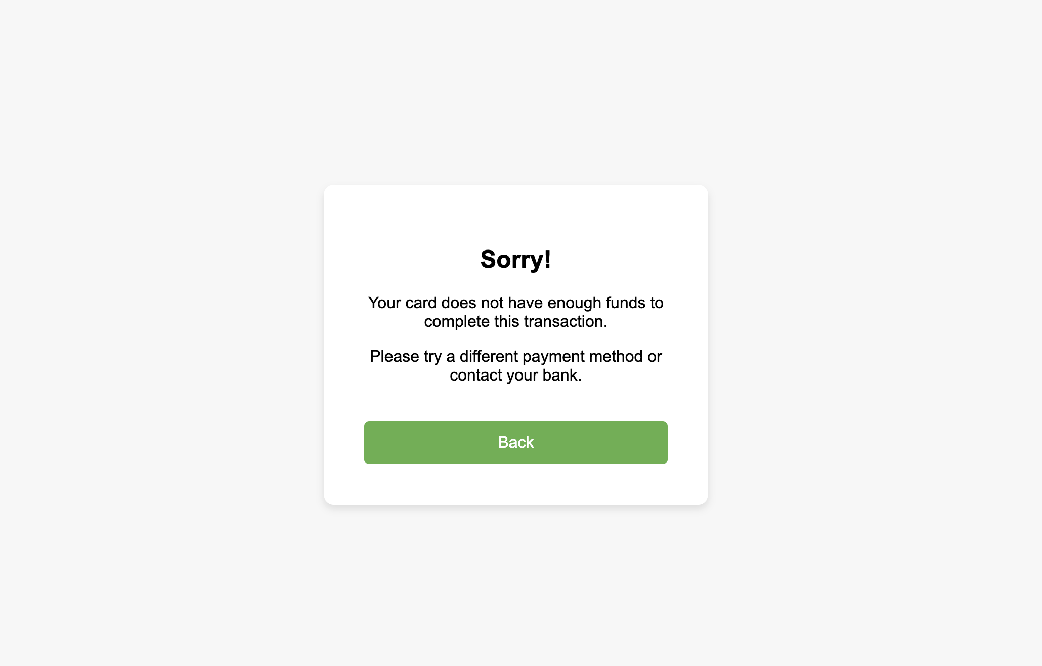
Once the payment is confirmed, the user is taken to a loading screen that simulates payment processing. After a 3-second delay, they are greeted with a fun “insufficient funds” message.
// Simulating Payment Process with a Twist
confirmPaymentBtn.addEventListener('click', function() {
  const cardNumber = document.getElementById('card').value.trim();

  // Validate the card number (basic check)
  if (!/^\d{12,19}$/.test(cardNumber)) {
    alert("Please enter a valid credit card number.");
    return;
  }

  // Show the loading screen
  showScreen(screen7);

  // After 3 seconds, show the insufficient funds message
  setTimeout(function() {
    showScreen(screen8);  // Move to the insufficient funds screen
  }, 3000);
});
The loading screen includes a CSS spinner:
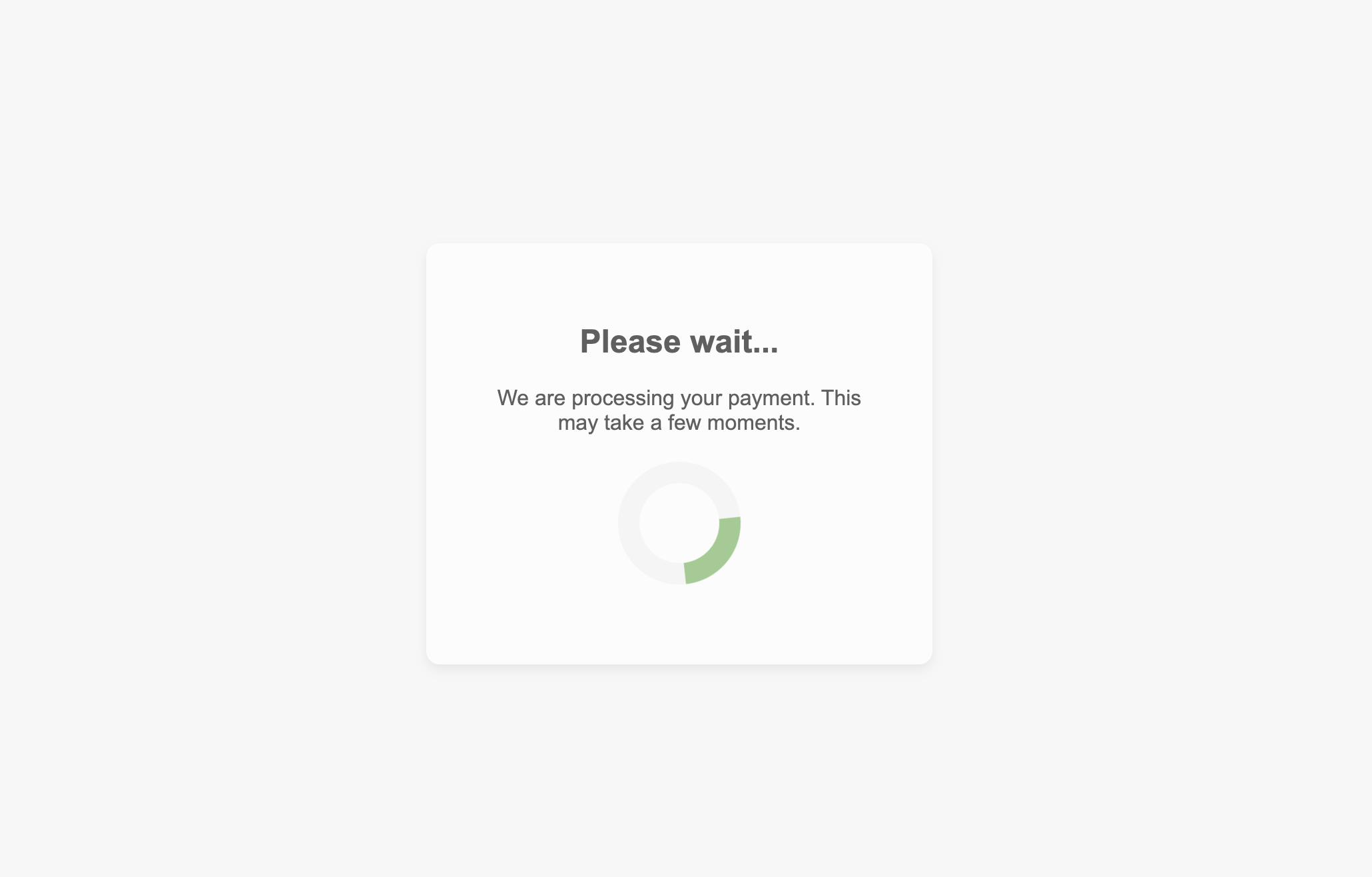
/* Loading Spinner */
.loader {
  border: 16px solid #f3f3f3;
  border-top: 16px solid #4CAF50;
  border-radius: 50%;
  width: 60px;
  height: 60px;
  animation: spin 2s linear infinite;
}

@keyframes spin {
  0% { transform: rotate(0deg); }
  100% { transform: rotate(360deg); }
}
Challenges and Solutions
Managing State Across Multiple Screens Each screen in the kiosk involves multiple user inputs that must persist across steps. I used JavaScript to store the user’s data in variables and passed it along to the review and payment screens.
Form Validation
Proper form validation was key to ensuring a smooth user experience. I added real-time validation to fields like the zip code and card number to avoid common input errors.
Conclusion
This mini project was a fun way to explore building a self-service kiosk. It pushed me to think about the user experience, especially the need for clear instructions, form validation, and playful touches like the humorous payment twist. By working through this project, I gained a deeper understanding of managing state between multiple screens and handling user inputs effectively.
If you’d like to try it yourself or check out the code, visit the links below!